In today’s busy world of brands and choices, standing out is super important.
Think about the brands you remember: they all have something special that catches your eye, right? Whether it is a familiar swoosh, a bitten apple, or perhaps a golden arch. Instantly, you know exactly what brand it represents. That, is the magic of visual identity.
Take Klark, for example. We started in 2023 and created a cool graphic plan for our brand using AI - thanks MidJourney!
But in 2024, we decided to shake things up and make it even better, to create something really convincing and easy to recognize.

In this endless world of brands and online activity, it's essential to get noticed. We all want people to know who we are. To do this, it's essential to have a strong visual style.
But...
Your brand's visual identity is like its face🌝
It reflects who you are, what you stand for, and why you matter. From your logo to your colors, it’s the cohesive visual language that speaks to your audience, whether they’re browsing your website or holding your product.
It’s about creating a visual language that speaks to your audience in a way that’s unmistakably you.
Here's the breakdown:
➡️ Your visual identity is the key to making a memorable impression and forging a connection with your audience.
Here's why it matters:
A robust visual identity isn’t just about aesthetics.
It's about creating a strong, consistent identity that helps you stand out, build trust and, ultimately, succeed in the competitive world of business.
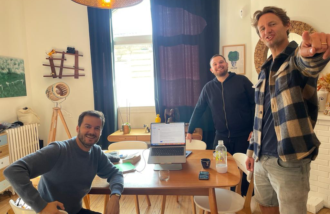
When Klark was created back in 2023, we had to come up with everything, including the visual identity. We started from scratch.
Although it was just James, Nicolas and Yoann, our 3 co-founders at the time.
And in March 2024, we decided to revamp it entirely to stand out more, to be even more recognisable.
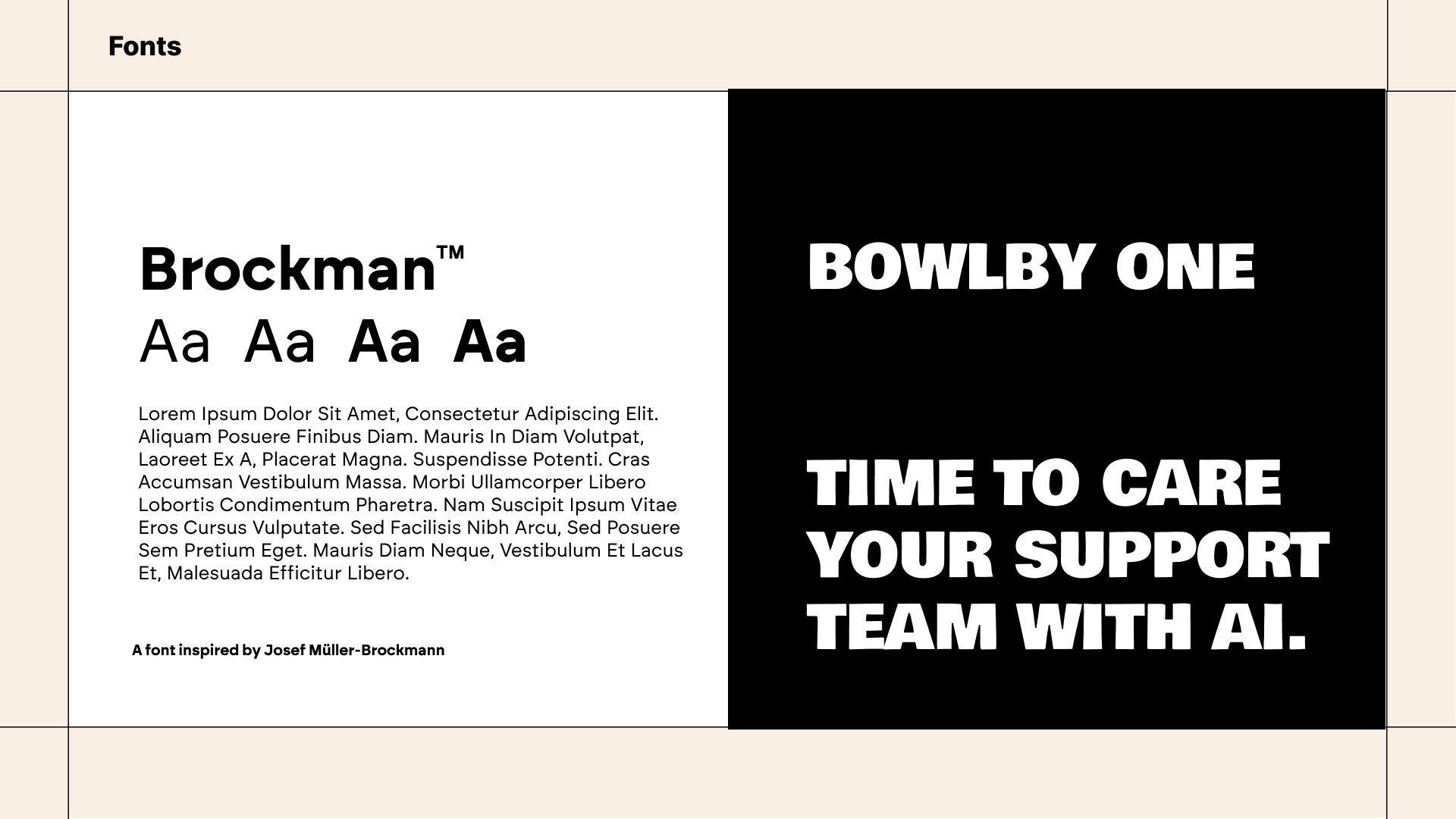
Choosing a font was tough. We switched between different options, some hard to read due to cramped letters, others too fancy. We considered using two fonts but couldn’t settle on a secondary one, opting for consistency with just one.
In the end, we chose a font that was impactful yet feminine, inspiring trust and calm.
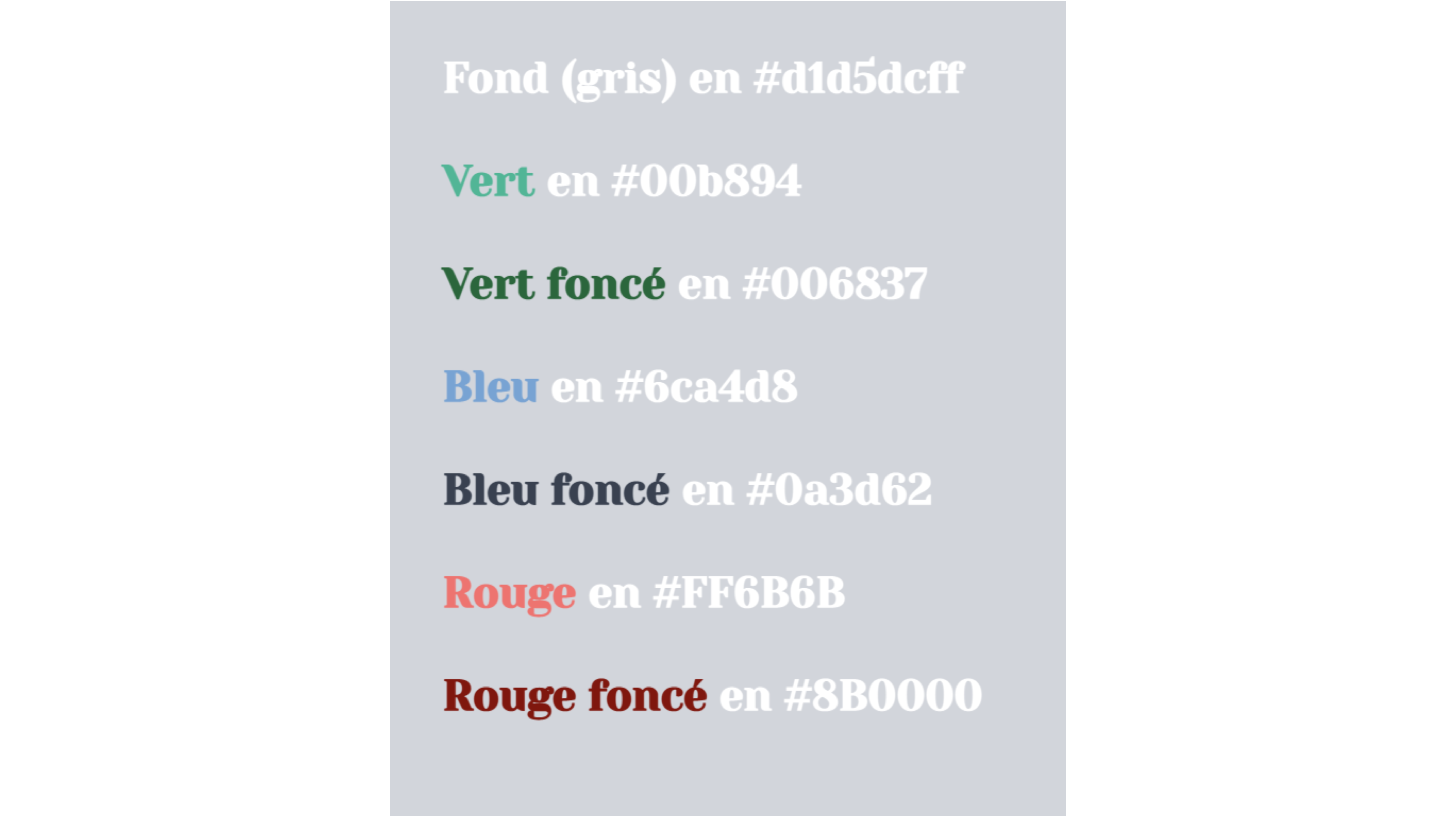
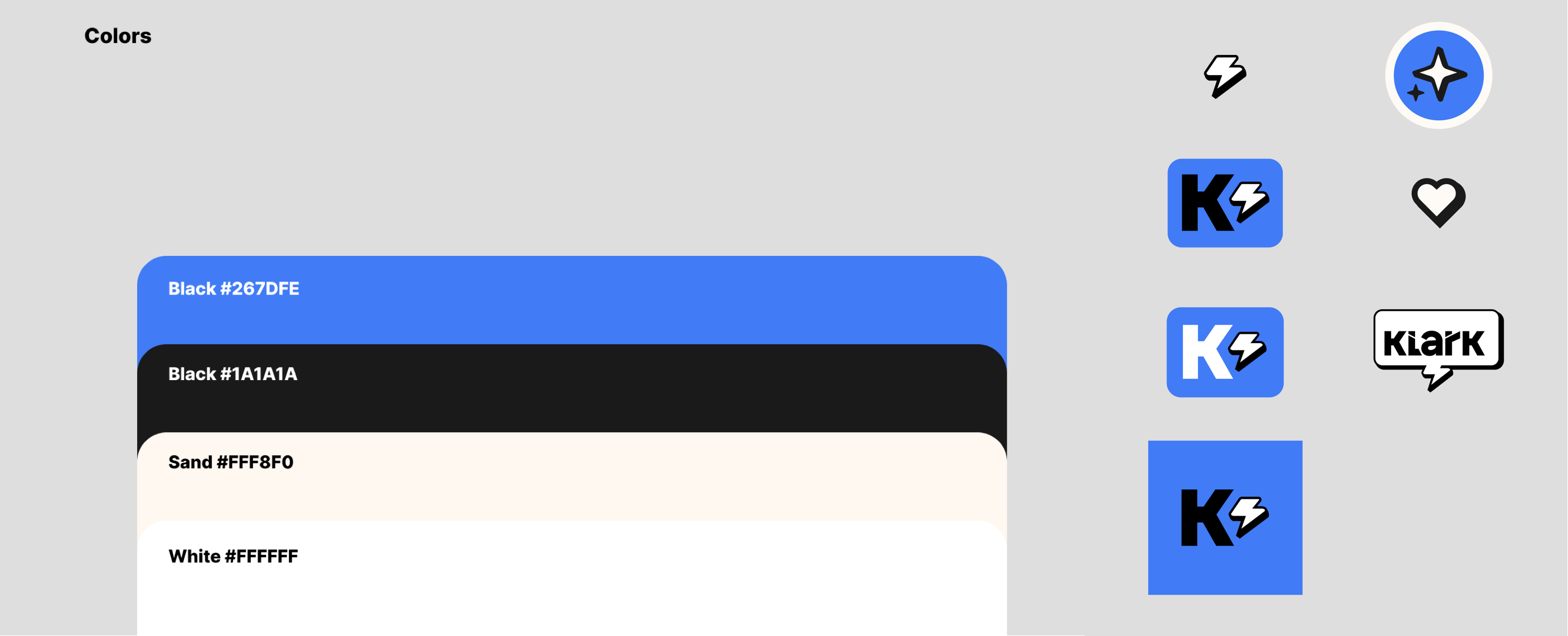
When it comes to colors, we knew we wanted a blue and a green. These colors are reassuring and green inspires positivity. The original draft for colors looked like this (see just below). We got rid of the red which could seem a bit threatening. But we kept the dark blue and green because they have a calming effect and feel reassuring.
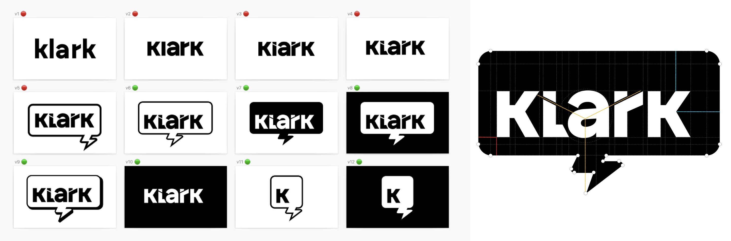
The logo plays a vital role in how people see a brand. We wanted the logo to be a lightning bolt because it symbolises the quick solutionsKlark offers to CRM agents. Plus, the original name idea was “Super Agent,” so it just made sense.
To create the logo, we used Mid Journey with a prompt: “Create a logo for an artificial intelligence company. The logo should feature a stylized lightning bolt, symbolizing rapid response. The style should have a superhero feel to it”. We tried out lots of options, but none felt quite right.
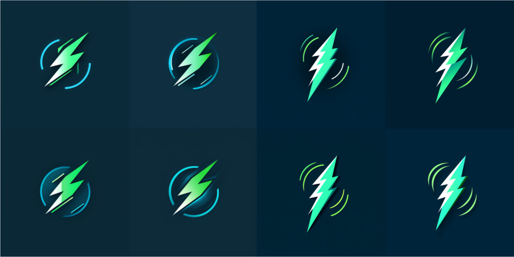
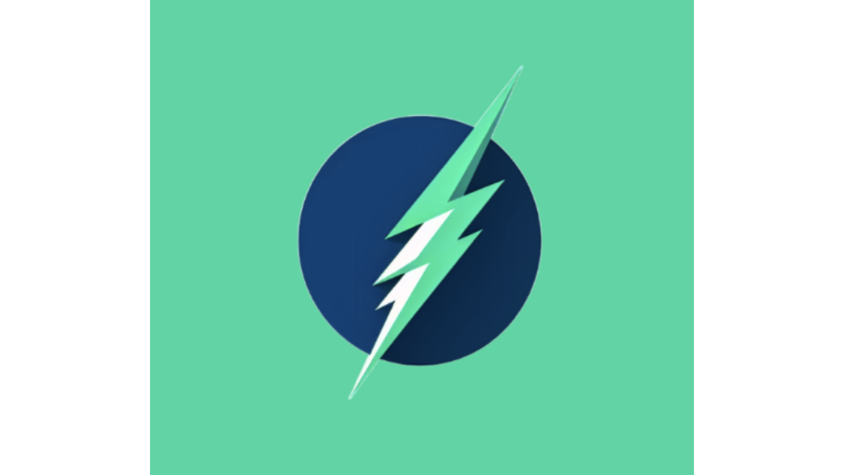
Until we landed on The One:
We even played with the idea of creating a character. But the idea didn’t stick very long😅
Choosing a name for our product was a big deal obviously. Our initial idea was “Super Agent,” but it felt too lengthy. So, we scoured the internet for ideas and options that were available.
We had a few contenders:
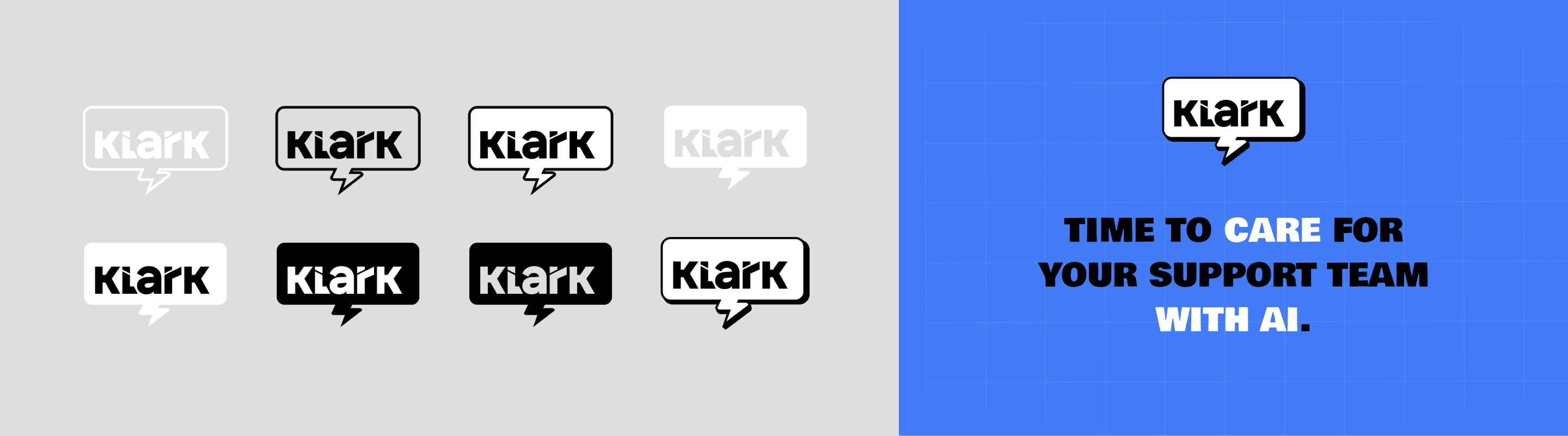
Then, Nicolas stumbled upon Klark.ai, and it just clicked. It was love at first sight. They all agreed: it paired perfectly with the lightning bolt logo. It had that superhero vibe, reminiscent of a certain Clark Kent🤔

The second time around, we aimed for a lighter, more professional feel. A design that would make a stronger impact. The goal was to shed the homemade look and embrace a sleek, modern aesthetic that mirrors the sophistication of our product.
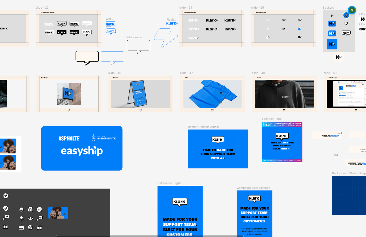
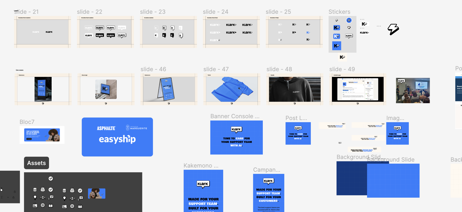
Every detail mattered. From the curvature of the logo to the spacing between letters, we wanted to ensure that every aspect of our branding reflected our values and resonated with our audience. That’s why we decided to partner with Sigmoon, a design agency that specializes in crafting compelling visual identities.
One of the key considerations was dimensions. We wanted our logos to be easily recognizable and readable, even from a distance, whether they were displayed on a billboard or a business card. This meant ensuring that the proportions were just right, so our logos would look equally impressive no matter the size.
Our logos became more than just symbols: they became the embodiment of our brand’s values, helping us forge deeper connections with our audience and achieve our business goals.

Simplicity was key. We streamlined our color palette to feature just one accent color, making our brand instantly recognizable while maintaining a neutral backdrop that exudes versatility and elegance.
Through this simple identity, we wanted to convey how easy and low tech Klark is to install and to use.
The same goes for the fonts. We wanted something simple, impactful, scalable, bold and easily recognizable.
Of course, our website was updated too. A design that we tried but didn’t stick with was this:
.png)
With this, we wanted to show that we are an AI brand that empowers humans instead of trying to replace them.
But our end goal on the website is to show what we do, to show the product. So we ended up going with a more abstract, more product-driven look to really let our product shine✨
Crafting an impactful visual identity isn’t just about making things look good (although that’s definitely a bonus!). It’s about telling your brand’s story in a visual language that people can’t help but notice and remember.
At Klark, we’ve been on our own visual identity adventure, from wrestling with fonts and colors to finally finding our groove with simplicity and professionalism.
We ought a huge thank you to Sigmoon for making our dream come true and giving a face to our brand!🌜
But whether you’re just starting out or giving your brand a facelift, remember this: a solid visual identity isn’t just a nice-to-have — it’s a must-have. It’s the secret sauce that helps you stand out in a sea of sameness, build trust with your audience, and pave the way for success in the wild world of business.
So go ahead, dive in, and let your brand’s personality shine through in every color, font, and logo.
Believe me, you won't regret it!
Solène Augait, Marketing at Klark for our beloved co-founders, James, Nicolas and Yoann.